UX/UI for Internet Infrastructure
While on contract with Comcast TAP Team (Technology Access Platforms), I helped design a web-based enterprise application. “ECAF” is critical to Comcast’s management of its nation-wide internet infrastructure. I worked one-on-one with developers, engineers and team leaders to develop mental models, a visual styleguide and component library. I helped roll out user-centered features and create branding for the team.

Problem Definition
1. How might we improve an enterprise application by getting feedback from its users?
2. How might we standardize front-end styles with documentation and developer engagement?
3. How might an internal application benefit from branding?
Research
ECAF (Enterprise Capacity and Facilities) is an enterprise application used by network engineers and hawk-eyed managers to monitor a large and complex hardware network. Designing experiences for this type of project requires a high level of expertise, so research is crucial at every step. My first task was to learn a lot about network engineering! I conducted many series of interviews with experts from across the country to walk me through their behaviors, tasks and areas for improvement. While becoming a content expert I also had to learn the development team’s waterfall management process. When I started there was no differentiation between front-end and back-end development and no UI tools in place. I identified key problem areas and mental models, created IA maps, reviewed site analytics to show how design could influence the entire TAP organization.
Research readout slides

A core challenge on this team was prioritizing front-end work, so models like this one illustrated design’s sphere of influence.
Iteration
As the only UX or UI designer on the team, I had my work cut out for me. To build rapport I relied on mockups and wireframes to illustrate ideas rather than text and spoken requirements. Stakeholders and developers alike realized this critical step had been missing. There had been no visual iteration before coding. My Sketch to Invision wireframes served as talking points for meetings, clarification of requirement gathering, and generated consensus before spending precious development time.
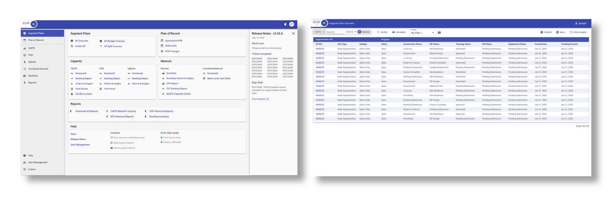
Low-effort, high-impact redesigns of the homepage and most visited page
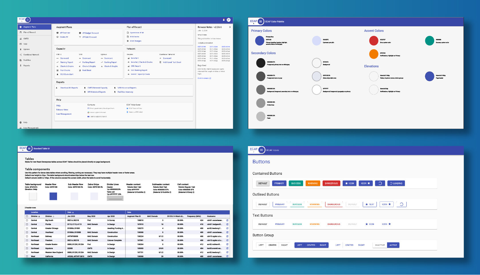
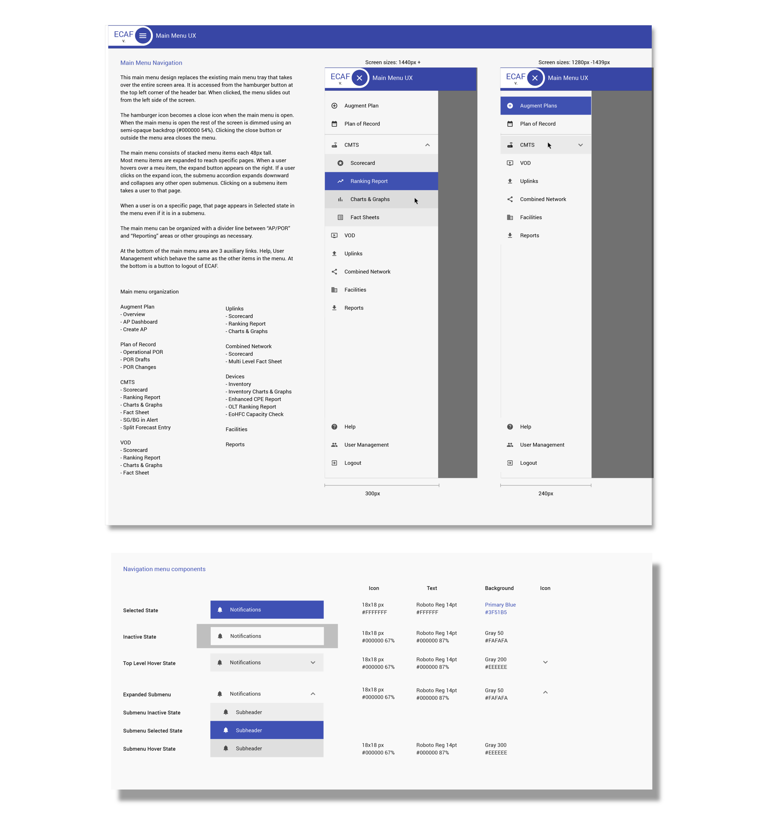
UI Standards
The core need of this project was UI standardization. When I started, developers built front-end components ad-hoc or used generic Material UI libraries without guidelines. There was no standard layout, color palette, type stack or component style guide. My goal was to set examples for how to use generic components, maintain layout standards and build themes and custom components where necessary. By using Invision prototypes with consistent visual language, the team began to consider what ECAF’s look and feel could be and how to implement it in code using Storybook and Github repositories.


Branding
The team I worked on oversaw multiple enterprise applications and wanted to unite them visually to have better standing within Comcast. I designed some graphical assets to use as branding and logos for internal communications. Over time this branding could be used to standardize color palettes, naming conventions, and product lines.

ECAF is currently the core capacity management application for Comcast’s entire customer infrastructure supporting thousands of sites and millions of customers.